
Many real-life situations can be modelled using sinusoidal functions. Radio waves, tides, musical tones, and electrical currents are few examples. In this lesson, you will learn to plot the graph, model and solve such real-life situations.
Representing real-world situations using table of values and graphs

Movement of the tides
The movement of the tides follows a periodic pattern as the water ebbs and flows into and away from the shore. The following data set represents the movement of the tides in a particular bay on the West coast of Canada over the course of 18 hours. The height corresponds to how far in to shore the tides move from a reference point in the bay. When the values are high, it means the tides have flowed in and the water is closer to the shore. When the values are low it means the tides have ebbed away and the water is farther from the shore.
| Time (hrs) | 1 | 2 | 3 | 4 | 5 | 6 | 7 | 8 | 9 |
|---|---|---|---|---|---|---|---|---|---|
| Height (m) | 3.1 | 4.5 | 6.2 | 7.5 | 8.4 | 8.5 | 7.8 | 6.6 | 5.0 |
| Time (hrs) | 10 | 11 | 12 | 13 | 14 | 15 | 16 | 17 | 18 |
| Height (m) | 3.3 | 2.4 | 2.1 | 2.8 | 4.0 | 5.4 | 7.0 | 8.4 | 8.5 |
Try it!

Use the data in the preceding table to create a graph and use your graph to answer the following questions:
What is the low tide value?
2.1
Does the high tide value represent a maximum or a minimum?
Maximum
What is the amplitude of this periodic relationship for the tides?
3.2
What is approximate the period value for the tides?
12 hours
Explore this!

Explore the following video to enhance your understanding about finding sine and cosine functions in various data sets.

Data relationships modelled by periodic functions
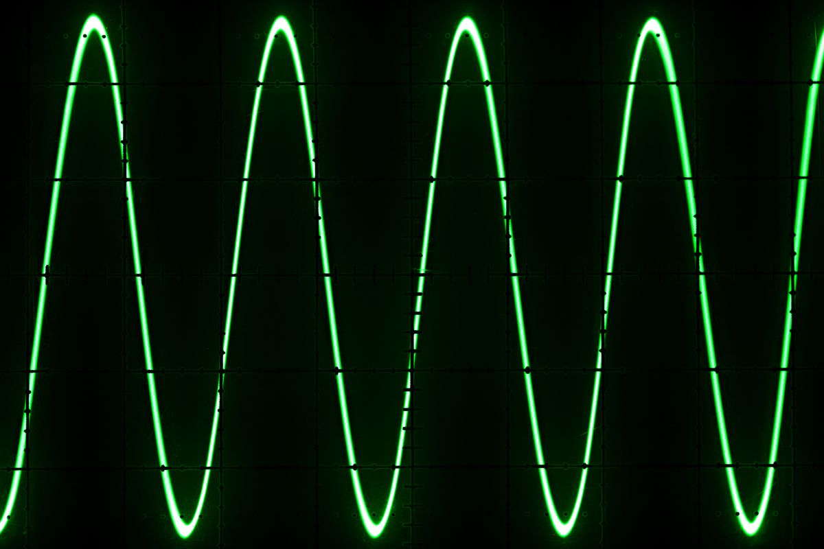
Sinusoidal equations are common in a great number of naturally occurring applications. In this part, you will graph data arising from real-world situations that can be represented by sinusoidal functions. You will then use the graph to make predictions about the future behaviour of the relationship.
Exercise 1
Graphing data that models a sinusoidal function
The following exercise illustrates how the relationship between temperature and time can be modelled by a periodic function.
The data in the following tables indicates the mid-season high temperature recorded over a four-year period for a city in Ontario.
| Season/Year | Month | Temperature (°C) |
|---|---|---|
| Winter 2014 | February | -9 |
| Spring | May | 16 |
| Summer | August | 25 |
| Fall | November | 3 |
| Winter 2015 | February | -10 |
| Spring | May | 17 |
| Summer | August | 27 |
| Fall | November | 3 |
| Season/Year | Month | Temperature (°C) |
|---|---|---|
| Winter 2016 | February | -10 |
| Spring | May | 16 |
| Summer | August | 26 |
| Fall | November | 3 |
| Winter 2017 | February | -9 |
| Spring | May | 16 |
| Summer | August | 25 |
| Fall | November | 3 |
Notebook

In your notebook, plot a graph of the temperature versus the month. In order to plot the data, assign a number to each month, starting with January 2014. Let January 2014 be month 1, then February 2014 is month 2, and May 2014 is month 5, and so on, until, finally, November 2017 is month 47.
When you plot the points, you should notice that it has a shape that resembles a sine curve. Connect the points by drawing a sine curve.
Notice that some of the points are slightly off the sine curve. This is because the data in the table varies a bit from year to year. This often happens when graphing real-world data or natural event. In this case, the temperature numbers are not always exactly the same from year to year, so the curve of best fit does not need to exactly match all the data points.
Does the graph model a periodic function? Explain.
The graph models a periodic function because it contains a repeating pattern. However, the temperature values vary slightly from year to year. For example, some winters are colder than others.
Use the graph to estimate the approximate period and amplitude of the relationship.
The period is one year, or 12 months (from February to February). The amplitude is half the distance from the minimum to the maximum value. In 2016, the minimum temperature value is –10 and the maximum value is 26, so the amplitude is half of 36, which is 18. Note that this value is an estimate, since the data values are slightly different for each year.
In your notebook, extend the graph to predict what the mid-season high was for winter, spring, summer, and fall of 2018. When you’re finished, compare your answers with those provided.
Your extended graph should resemble the following:
And here are the actual mid-season high temperatures for the year 2018:
| Season 2018 | Temperature (°C) |
|---|---|
| Winter | -15 |
| Spring | 12 |
| Summer | 28 |
| Fall | 4 |
Consider whether your predictions were close to the actual weather that happened. Explain the significance of these values.
The values do not follow the pattern that occurred in the years 2014 to 2017. The winter and spring temperatures are lower and so the winter and spring of 2018 were much colder than previous years. The temperatures for summer and fall are slightly higher than the previous four years.
This data indicates that though there are patterns in nature, the patterns are not followed perfectly, and in some years there could be deviations from the general, overall pattern.
Applications of sinusoidal functions
In the previous part of this learning activity, you graphed data that represented a sinusoidal function. Now, you’ll examine a variety of situations that involve transformations of the graph of .
In addition to graphing sinusoidal functions from given transformed equations, you will also apply your graphing skills from the previous lesson to determine the equation that models the given situation. You will examine how the period, amplitude, vertical shift (vertical displacement), and phase shift interact within the applications.
In general, the equation of a sinusoidal function is , where:
- is the amplitude
- is the period
- is the phase shift
- is the vertical shift
Note the added in this formula. While we did not specifically examine horizontal stretches and compressions for trigonometric functions, this type of transformation is sometimes necessary to find a model to fit certain application questions. You need not focus specifically on how the parameter is derived other than to understand that when the period changes, it causes a horizontal stretch or compression of the graph.
Explore this!
Explore the following video to learn how to determine the equation of the sinusoidal function.
Exercise 1:
In the following exercise, only the equation is provided. The equation is used to create a table of values from which the graph of the function is obtained.
You can model the average monthly temperature of Windsor, Ontario, with the following sinusoidal equation:
where is the temperature in Celsius and represents January, represents February, and so on.
Calculate the average temperature in Windsor for each month of the year.
t is for the month of the year, starting in January, when t = 0 and ending in December when t = 11.
| Month (t) | Average temperature (°C) |
|---|---|
| January (t = 0) | -1.9 |
| February (t = 1) | 0.10 |
| March (t = 2) | 5.55 |
| April (t = 3) | 13 |
| May (t = 4) | 20.45 |
| June (t = 5) | 25.90 |
| July (t = 6) | 27.90 |
| August (t = 7) | 25.90 |
| September (t = 8) | 20.45 |
| October (t = 9) | 13 |
| November (t = 10) | 5.55 |
| December (t = 11) | 0.10 |
Notebook
Using the data from the table above, sketch a graph of the average monthly temperatures in your notebook. Compare your work with the suggested answers provided.
As you can notice, the graph is periodic. It repeats itself every 12 months. The graph displays to so that you can see the cyclical pattern of the function.
When is the monthly temperature highest?
The monthly temperature is highest in July, at 27.9°C.
What is the period of the temperature function? What is significant about this value?
Examining the graph, you can identify that the period is 12. This value is significant because there are 12 months in a year.
The function repeats itself every 12 months.
In the following exercise, the graph is provided and the equation must be found using information from the graph. The horizontal scale is marked in degrees and the period is 360°. The equation that models this application is of the form .
Exercise 2:
Previously, you investigated the periodic pattern found in the movement of a Ferris wheel. The height of the rider was recorded relative to the x-axis.
Try it!
In the following graph, the height of a rider is relative to the ground as the Ferris wheel makes two revolutions; each revolution is 360°. Determine an equation that models this situation.
If you mark the points (90°, 6), (180°, 11), (270°, 6), (360°, 1), (450°, 6) on the given graph, you can see that this periodic function is a transformation of .
The period from the starting point (90°, 6) to the end point (450°, 6) is 450° – 90° = 360°.
Therefore, the equation will be of the form .
Since the sine curve begins at , the phase shift is .
The amplitude is , so .
The maximum value is 11, which is 6 more than the amplitude, so the vertical displacement is .
Therefore, an equation that models this situation is .
Exercise 3:
Let’s examine a real-world situation that can be observed if you take a trip to the ocean. This exercise demonstrates that the effect of the Moon on the tides of the Earth is periodic.
If you have ever been to the ocean, you may have noticed that as the tide comes in and flows out, the height of the water changes. The strength of the tides is different at various points along the coast. The following graph represents the height of the water over a 24-hour period at a specific point on a pier in the Atlantic Ocean.
Try it!
State the maximum and minimum values of the graph. What do these values represent?
The maximum value on the graph is 2 m and the minimum is 0 m. These values represent the difference in the height of the water at high tide and low tide.
Determine the amplitude of the graph.
The amplitude is half the distance between the maximum and minimum value of the graph. Half of 2 m is 1 m. So the amplitude is 1.
Determine the period of the graph. What does this value represent?
Since the part of the graph from 0 hours to 12 hours is repeated from 12 hours to 24 hours, then one cycle takes 12 hours. Therefore, the period is 12 hours. This value represents the fact that the tide repeats itself every 12 hours.
In your notebook, determine an equation that models the tide.
The graph does not use degrees. The scale on the horizontal axis is in hours so the equation will be of the form
Mark the following points on the graph: (3, 1), (6, 0), (9, 1), (12, 2), and (15, 1). Draw a horizontal line to indicate the rest position between these points.
Observe that these points mark a sine curve that has been reflected in the -axis and moved up by one unit. You already know the amplitude is 1, but the reflection in the -axis indicates that . Since the maximum value is 2, which is 1 more than the amplitude, the vertical shift is . You also know the period is 12 so . Since (3, 1) marks the first point on the sine curve, this indicates that the graph has been shifted three units to the right, so .
Substitute the values , , , and into the equation.
The equation that models the tide is or .
Next, you’ll examine a real-world situation that can be observed from any window. The following exercise on the next page demonstrates how the hours of daylight throughout the year can be modelled by a sinusoidal function.
Exercise 4:
The number of hours of daylight varies throughout the year. You may know that December 21 is the shortest day of the year, having approximately 7.5 hours of daylight in southern Ontario. The longest day, June 21, has approximately 16.5 hours of daylight.
The following graph shows the amount of daylight in southern Ontario over a year. The graph starts at March 21, the first day of spring, which has 12 hours of daylight.
The amplitude is the distance between the rest position and the maximum or minimum value. The maximum value is approximately 16.5. The distance from 12 to 16.5 is 4.5.
Another way to calculate the amplitude is to find half the distance between the maximum and minimum values, that is,
Therefore, . The vertical displacement is found by subtracting the amplitude from the maximum value, that is, . Another way to find the vertical displacement is to add the amplitude to the minimum value, that is, .
Therefore, . There is no phase shift since the graph begins at the -axis, so . The period of the graph is 365 days, so .
Substitute , , , and into .
Therefore, the equation that models the number of daylight hours in southern Ontario is .
Try it!
Use the equation you found to determine the number of hours of daylight on April 1.
The graph begins at March 21. There are 31 days in March, so April 1 occurs 11 days after March 21.
Substitute into to find .
Therefore, there are approximately 12.85 hours of daylight on April 1.
Now use the equation to determine the number of hours of daylight on September 1.
First determine how many days September 1 falls after March 21.
March 21 – 31 = 10 days
April = 30 days
May = 31 days
June = 30 days
July = 31 days
August = 31 days
September = 1 day
Total = 164 days
Substitute into to find .
There are approximately 13.41 hours of daylight on September 1.

Self-check
As a self-directed learner, you will be reflecting on your learning process and checking your understanding in order plan for success. Make a note of your understanding of the success criteria from today’s activity.
Rate your understanding on a scale of five to one.
Five means “I have a thorough understanding.” One means “I am confused.”
Are you able to
Math journal

At the end of the course, you will fine-tune 8 entries (two from each unit) from your math journal and submit them as your “Culminating assessment - Math journal” (Opens in new window).
Take pictures of two real-world events that would be modelled by a sinusoidal function. Why do you think these represent sinusoidal functions? Try to estimate equations that could represent the events. You may want to use GeoGebra to help.
Once you feel comfortable with the success criteria, complete the following questions to assess your progress.
Notebook
You can use your notebook to complete each of the following questions. Compare your work with the suggested answers to check your understanding.
Assess your understanding: Graphing sinusoidal functions
The following two tables show the daily high temperature, as recorded every 30 days, for a town in British Columbia for two years beginning January 1, 2015.
| Day number | High temperature (°C) |
|---|---|
| 0 | -1.9 |
| 30 | 0.1 |
| 60 | 5.5 |
| 90 | 13.1 |
| 120 | 20.5 |
| 150 | 25.9 |
| 180 | 27.9 |
| 210 | 26.0 |
| 240 | 20.3 |
| 270 | 13.2 |
| 300 | 5.6 |
| 330 | 0.2 |
| 360 | -1.9 |
| Day number | High temperature (°C) |
|---|---|
| 390 | 0.1 |
| 420 | 5.5 |
| 450 | 13.1 |
| 480 | 20.5 |
| 510 | 25.9 |
| 540 | 27.9 |
| 570 | 26.0 |
| 600 | 20.3 |
| 630 | 13.2 |
| 660 | 5.6 |
| 690 | 0.2 |
| 720 | -1.9 |
In your notebook, draw a graph to represent the data. Compare your work with the suggested answers provided.
Your graph should look something like this:
Does the graph model a periodic function? Explain.
The graph models a periodic function because the values along the vertical axis are repeated and so the graph contains a repeating pattern.
Use the graph to estimate the approximate period and amplitude of the relationship.
One cycle begins at day 0 and ends at day 360, so the period is 360 days.
The minimum value is -1.9 and the maximum value is 27.9.
Explain how your graph can be used to predict the daily high temperature for another cycle of 360 days.
The graph can be extended by drawing another cycle for the next 360 days. The values on the graph can then be used to predict the daily high temperature for 30-day periods.
Extend the graph for one more cycle.
Predict the daily high for day 840.
To use the graph to predict the temperature for day 840, move your finger along the horizontal axis. The scale is one square = 60 days, so day 840 is represented by the square before day 900. Find the corresponding vertical value on the graph. It is approximately 20°C.
Will the actual daily temperature be exactly the same for day 840? Explain.
There is no guarantee that the actual daily high temperature for day 840 will be exactly the same. It may or may not be the same, depending on weather patterns.
Assess your understanding: Graphing sinusoidal functions
The model of a city’s average monthly daily high temperature is the sinusoidal equation where T is the temperature in Celsius and represents January, represents February, and so on.
Calculate the average temperature for each month of the year and record it in the table.
| Month (t) | Average temperature (°C) |
|---|---|
| January (t = 0) | -2.5 |
| February (t = 1) | -0.69 |
| March (t = 2) | 4.25 |
| April (t = 3) | 11 |
| May (t = 4) | 17.75 |
| June (t = 5) | 22.69 |
| July (t = 6) | 24.5 |
| August (t = 7) | 22.69 |
| September (t = 8) | 17.75 |
| October (t = 9) | 11 |
| November (t = 10) | 4.25 |
| December (t = 11) | -0.69 |
Graph some of the points on a curve indicating the average monthly temperatures.
Your graph should resemble the following:
When is the monthly temperature highest?
The monthly temperature is highest in July.
What is the period of the temperature function?
The period of the function is 12.
What is significant about this value?
This is significant because there are 12 months in a year. The average monthly temperature graph cycles every 12 months.
The average depth of the water at the end of a pier is 2 m at low tide and 12 m at high tide. One complete cycle takes 12 hours. Assume that high tide is at 00:00 hours (midnight).
Create a sinusoidal equation that represents the depth of the water.
The amplitude is . The graph will be a reflection in the x-axis (similar to the one shown in Exercise 3), so .
The period is 12 hours, so . The vertical shift is , so . The first point on the sine curve will be (3, 7), so the phase shift is .
Substitute the values , , , and into the equation to get
In simplified form, an equation that models the tide is .
Draw the graph of the depth of the water over a 24-hour period. Assume that high tide is at 00:00 hours (midnight).
The graph will be similar to the one shown in Exercise 3; however, the maximum and minimum values will be different, since the amplitude and vertical shift are different. The period is 12. The maximum value is 12 and the minimum value is 2. The y-intercept is (0, 12). Other points on the graph are (3, 7), (6, 2), (9, 7), (12, 12). The y-values of these points repeat themselves, as for the next 12 hours.
Use the graph to estimate the depth of the water at 06:00 hours (6:00 a.m.) and 15:00 hours (3:00 p.m.).
Interpolating from the graph, the depth of the water at 06:00 is 2 m and at 15:00 it is 7 m.
A Ferris wheel has a radius of 12 m and is 2 m above the ground. The Ferris wheel makes a rotation every 20 seconds. Assume the Ferris Wheel begins at its middle height.
Using pencil and paper, sketch the sinusoidal wave, showing two complete rotations.
Your graph should resemble the following:
Determine the equation of the sine curve that models this situation.
or
Identify ways in which the scenario would change if the radius of the wheel were changed to 16 m.
If the radius of the Ferris wheel was 16 m, the equation would change to (assuming the wheel still makes one rotation every 20 seconds). The rider would again be lowest at 2 m above ground, but the greatest height above ground would be 34 m (compared to 26 m if the radius is 12 m).
Use the equation you developed previously, , to predict the amount of daylight on June 1. Note that the following graph that shows the amount of daylight in southern Ontario over a year. The following graph starts at March 21, the first day of spring, which has 12 hours of daylight.
For June 1:
March 21 to 31 = 10 days
April = 30
May = 31
June = 1 day
Total = 72 days
There will be 16.26 hours of daylight.
Now, use the same equation, , to predict the amount of daylight on December 1.
For December 1:
March 21 to 31 = 10 days
April = 30
May = 31
June = 30
July = 31
August = 31
September = 30
October = 31
November = 30
December 1 = 1 day
Total = 255 days
Therefore, there will be 7.73 hours of daylight.
The amount of daylight varies depending upon a location’s latitude. In a certain location, the amount of daylight on the longest day, June 21, is 15.3 hours. The amount of daylight on the shortest day, December 21, is 9.1 hours. The period is 365 days.
Find an equation to relate the day of the year, beginning with March 21, to the number of hours of daylight.
Equation:
Therefore, the equation that models this situation is .
In your notebook, construct a graph of the equation for 365 days (you may use intervals of 30 days to complete your sketch). Compare your graph with the suggestions provided.
Your graph should resemble the following:
Calculate the number of hours of daylight for this location on October 31.
For October 31
March 21 to 31 = 10 days
April = 30
May = 31
June = 30
July = 31
August = 31
September = 30
October = 31 days
Total = 224 days
There will be 10.17 hours of daylight.
Assessment Opportunity

Journal Submission
You are now almost at the end of the course. At the end of the next learning activity you will submit your “Culminating Assessment - Math journal” (Opens in new window).
To prepare you for the culminating assessment, you have the opportunity to submit a journal entry from this unit to be assessed (no grade will be recorded) for feedback before the final culminating assessment. It will be assessed according to the culminating assessment rubric. You may choose to make any updates of suggestions and submit it for the culminating assessment at the end of the course. Make sure to refer to the culminating task requirements for clarification of expectations. When you are ready, submit your assessment by following the submission directions.
MCF3M Culminating Assessment: Math journal
Even though you will not be receiving a grade for this particular journal submission, it is important that you remain mindful of how your culminating activity journals will be measured. That is why you are being remind of the following rubric, which your teacher will use in producing your final overall assessment.
You may receive the following forms of feedback:
- Your teacher may highlight the phrases on the rubric that best describe your assignment to show you how you have done.
- Your teacher may also provide you with detailed comments about the strengths of your assignment, the areas of the assignment that need improvement, and the steps you should take before submitting another assignment like this one.
Success Criteria:
- knowledge of relevant and appropriate skills and procedures
- knowledge of relevant and appropriate facts and terms
- understanding of the meaning of the mathematical content
| Level 4 | Level 3 | Level 2 | Level 1 |
|---|---|---|---|
| With a high degree of effectiveness | With considerable effectiveness | With some effectiveness | With limited effectiveness |
Success Criteria:
- logical interpretation of problem
- evidence of modelling the problem, drawing conclusions, or justifying reasoning
| Level 4 | Level 3 | Level 2 | Level 1 |
|---|---|---|---|
| With a high degree of effectiveness | With considerable effectiveness | With some effectiveness | With limited effectiveness |
Success Criteria:
- math vocabulary used accurately math notation and symbols used appropriately
- algebraic solutions, graphs, charts, diagrams organized and clearly written
- mathematical thinking expressed clearly
- reflection on mathematical thinking expressed clearly
| Level 4 | Level 3 | Level 2 | Level 1 |
|---|---|---|---|
| With a high degree of effectiveness | With considerable effectiveness | With some effectiveness | With limited effectiveness |
Success Criteria:
- relevant and appropriate selection of facts, skills, procedures
- relevant and appropriate connections made between math concepts
- relevant and appropriate connections made between math and the world outside the classroom
| Level 4 | Level 3 | Level 2 | Level 1 |
|---|---|---|---|
| With a high degree of effectiveness | With considerable effectiveness | With some effectiveness | With limited effectiveness |
The teacher will assess your work using the rubric. Before submitting your assessment, review the rubric to ensure that you are meeting the success criteria to the best of your ability.
When you are ready, submit your assessment by pressing the "Submit Your Work” button and follow the submission directions.